
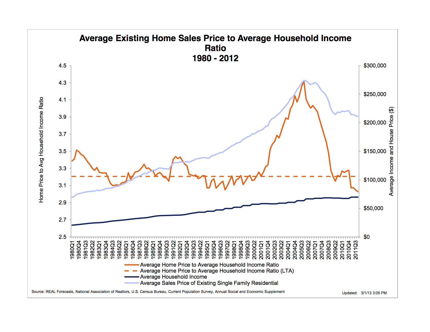
“The chart below shows the ratio of the average existing home sales price to average household income. The long term average (LTA) of this ratio has been slightly above 3.0. At the beginning of 2001, however, it began to rise rapidly, reaching a peak 33 percent higher than the LTA during 2005, and then declining precipitously back to its LTA during 2008. Peshut’s chart also shows that, as of the beginning of 2012, Fed monetary policy had been unable to restart a bubble in the housing market unlike it had done in financial asset, farmland, and commodities markets. In fact housing prices were still falling both absolutely and in relation to household income.”
http://bastiat.mises.org/2013/03/whence-the-housing-bubble/

Did you like this?
Tip Freedomwat.ch Staff with Bitcoin
Tip Freedomwat.ch Staff with Bitcoin
Related posts:
In Gem County, Idaho, It's a Crime to be a "Constitutionalist"
Regulators Play the Role of Police, Judge and Executioner: Witness Liberty Silver Corp.
Illinois Cops: Don't Legalize Weed, Or We'll Have to Kill Our Drug Dogs
Neo & Bee Bitcoin Bank Intro
A low saturated fat diet 'will not prevent heart disease or prolong life'
The 16 Most Important Bitcoinaires
The Eurozone Unemployment Picture
Florida man arrested for ‘molesting a manatee’
The NSA Actually Intercepted Packages to Put Backdoors in Electronics
Pentagon's African Command: “We Don’t Consider You a Legitimate Journalist”
NSA slides: Steve Jobs Is 'Big Brother' And Smartphone Users Are 'Zombies'
U.S. Secret Service Bans Sale of Silver and Gold Liberty Dollars on Ebay
Overstock Unveils Blockchain Trading Platform at Nasdaq Event
Florida Sun-Sentinel Reports On Covert FEMA Camp Roundup Drills
Have You Heard the One About the Fiat Money Printing Central Banker?