
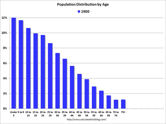
“This is a mesmerizing little animation created by Bill McBride of Calculated Risk. It shows the distribution of the U.S. population by age over time, starting at 1900 and ending with Census Bureau forecasts between now and 2060. As McBride points out, you can see a big ‘baby bust’ before and during the Great Depression, right before prosperity returns and the Baby Boom strikes. (You can also see the bulge of Baby Boomers ripple through the charts in the latter half of the 20th century.)”

Did you like this?
Tip Freedomwat.ch Staff with Bitcoin
Tip Freedomwat.ch Staff with Bitcoin
Related posts:
South Africa Platinum Output Falls Record 49% Due to Strike
Officer Arrested For Stealing Cash From Motorists
Member of U.S. Secret Service arrested for sexual abuse in Woodbridge
Economic exodus means two-thirds of Puerto Ricans may soon live in US
More Taxpayers Are Abandoning the U.S.
Gorbachev urges US-Russia deal on Syria
Syria opposition ‘disappointed’ but thinks Congress will OK strike
U.S. condemns ‘outrageous’ Tunisia assassination
Trump Administration Suspends Expedited H-1B Visa Approvals
SWAT-Team Nation: The Militarization of the U.S. Police
Jack Lew: The Rookie
US oil settles down 1.3%, at $51.65 a barrel; lowest since April
At Walgreen, Renouncing Corporate Citizenship
These Guys Want to Lend You Money Against Your Bitcoin
Google 'Donates' Millions For San Francisco Kids' City Bus Fares