
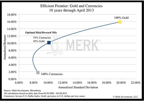
“The chart below graphs the efficient frontier between gold and a basket of currencies (represented by the Inverse US Dollar Index(2) over the past 10 years. Each point on the curve represents a different allocation mix between gold and other currencies. Simply for the purpose of illustration, the blue square on the line represents the optimal mix as defined by the highest return-vs.-risk ratio over the period analyzed. As noted in the movement along the horizontal axis, the optimal mix had lower annualized standard deviation (volatility): roughly half of the volatility of holding gold alone (10.09% vs. 19.80%) and yet realized the bulk of the upside from returns (10.10% vs. 15.87%).”
https://www.internationalman.com/78-global-perspectives/1000-downside-resilience,-anyone

Tip Freedomwat.ch Staff with Bitcoin