
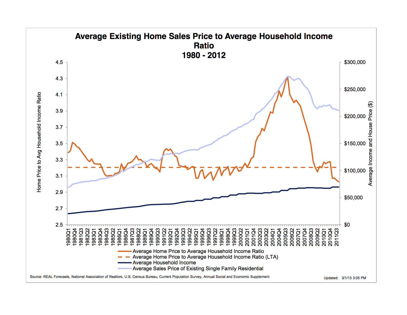
“The chart below shows the ratio of the average existing home sales price to average household income. The long term average (LTA) of this ratio has been slightly above 3.0. At the beginning of 2001, however, it began to rise rapidly, reaching a peak 33 percent higher than the LTA during 2005, and then declining precipitously back to its LTA during 2008. Peshut’s chart also shows that, as of the beginning of 2012, Fed monetary policy had been unable to restart a bubble in the housing market unlike it had done in financial asset, farmland, and commodities markets. In fact housing prices were still falling both absolutely and in relation to household income.”
http://bastiat.mises.org/2013/03/whence-the-housing-bubble/

Did you like this?
Tip Freedomwat.ch Staff with Bitcoin
Tip Freedomwat.ch Staff with Bitcoin
Related posts:
Now Mexico Bans Cash Transactions
Why Firing a Bad Cop Is Damn Near Impossible
28 Detroit houses selling for $500 at county auction
Universities to MOOCs: We Will Assimilate You
How You Can Quickly Make It into the World's 1% Richest
Blowback: How ISIS Was Created by the U.S. Invasion of Iraq
Hacker, Activist Aaron Swartz Commits Suicide
Florida man’s attorney claims NSA phone records will prove client’s innocence
Gold ETFs in India touch 40 tonne (40,000 kilo)
Homeland Security Raids Homes Seizing Vehicles For EPA Violations
What is the Cost of Mining Gold?
Thousands protest in Japan against new state secrets bill
Have a Gmail Account? Want to See what NSA 'Metadata' Really Means?
The Greatest Opportunity in 30 Years
Texas Police, Looking for More Military Hardware, Tout Its Use In Harvey Relief