
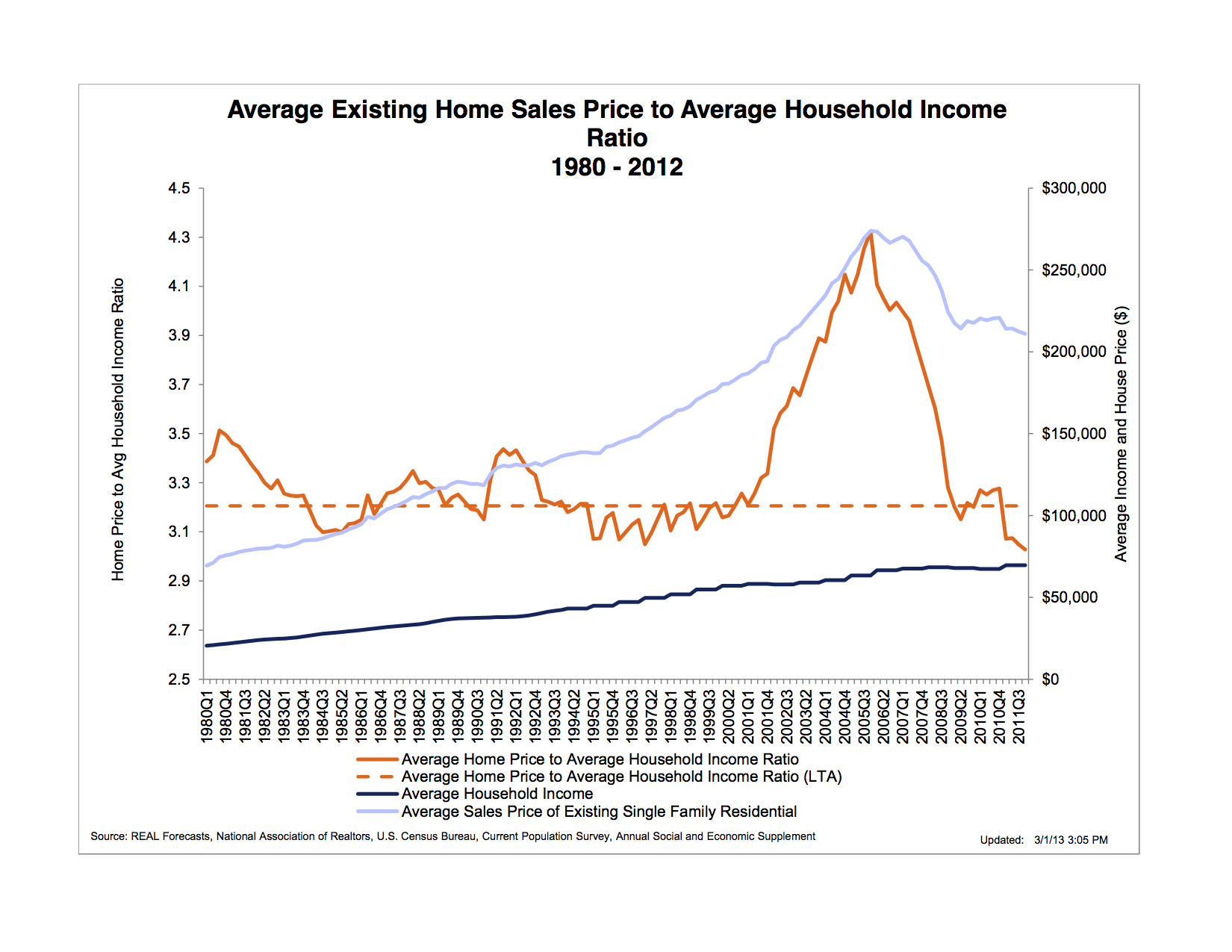
“The chart below shows the ratio of the average existing home sales price to average household income. The long term average (LTA) of this ratio has been slightly above 3.0. At the beginning of 2001, however, it began to rise rapidly, reaching a peak 33 percent higher than the LTA during 2005, and then declining precipitously back to its LTA during 2008. Peshut’s chart also shows that, as of the beginning of 2012, Fed monetary policy had been unable to restart a bubble in the housing market unlike it had done in financial asset, farmland, and commodities markets. In fact housing prices were still falling both absolutely and in relation to household income.”
http://bastiat.mises.org/2013/03/whence-the-housing-bubble/

Did you like this?
Tip Freedomwat.ch Staff with Bitcoin
Tip Freedomwat.ch Staff with Bitcoin
Related posts:
FBI calls half of populace with 9/11 doubts potential terrorists
Delinquent US student loans hit record high, over $100 billion past due
Drug Wars, Missing Money, and a Phantom $500 Million
What Is at Stake in the BLM vs. Bundy Showdown
School Offers Counseling for Students Troubled by Pastry-Gun Incident
How the Federal Reserve Just Hid Important Data
25 Facts About The Fall Of Detroit That Will Leave You Shaking Your Head
How a wire transfer stuck in OFAC almost cost me $140K
Defense Distributed Plans to Make Bitcoins Completely Anonymous
U.S. Government Forbids Ammo-Making Equipment from China
Protoshares & Selfish Mining
3-D-printed gun available for download after firing first shots
New Trend Guarantees Higher Gold Prices
Fedcoats & Presstitutes Exploit Americans' Ignorance With 'Boston Massacre' Propaganda
The room with 260 million surfaces: 3D printed architecture is here